NSL News: Broadcast Deal, 3 Brand Launches

The Canadian soccer community is still buzzing with excitement following the recent Northern Super League announcement! The new league has continued to generate hype by unveiling team brands and other important details, including a groundbreaking broadcast deal ahead of its 2025 launch. After many months of almost no news, it’s been a whirlwind over the past two weeks, and personally, my sleep schedule is shot. Hopefully this recap of what’s gone down is coherent. Here we go!
Broadcast deal demonstrates NSL’s ambition
Those who questioned the legitimacy of the project given the tight timeline and general struggles within the Canadian soccer ecosystem, are being proven wrong so far. Massive sponsors are already on board and now there’s an impressive broadcast deal, too. Women’s sport in the year of the lord 2024 is turning out to be a different beast than men’s sport, which is why comparisons to CPL (a la “if there’s a men’s league that’s struggling how do the women intend to survive?”) were always misguided.
The NSL’s newly signed broadcast deal with Bell Media / CBC is just the latest example of that. For years, the Canadian Soccer community was at war with our major sports broadcasters for failing to invest in or showcase Canada Soccer and the CPL. Details emerged during an ugly public dispute that the CSA previously had to pay TSN hundreds of thousands of dollars to air their matches, rather than receiving an industry-standard fee for the right to show games. That’s only one example of the messy media landscape that facilitated, or necessitated as some would argue, the whole CSB deal in the first place and caused the ensuing player protests (by the way, how’s that CBA coming?) and an untenable financial situation.
Enter Diana Matheson and the NSL. Sometimes it takes a woman to solve issues by looking at things differently than male sports execs might. Whether she leveraged her stellar reputation earned while donning the Canadian kit, the growing momentum behind women’s sports as a whole, or just didn’t have the baggage that other soccer execs had (perhaps all of the above), something clicked to facilitate this deal. Being able to rely on industry veteran Nathalie Cooke, the former VP at TSN who spent 9 years with TSN/Bell and 4 with Canada’s Olympic Broadcaster, was certainly an asset in the process as well.
Admittedly inspired by the PWHL and other women’s leagues worldwide, Matheson’s key priority around broadcasting was always visibility. Most top 5 women’s soccer leagues made their games accessible for fans, increasingly global fans, in the first decade of their existence, often having to shoulder production costs. The PWHL made every game available free on YouTube while also showing games on linear channels (TV). Fans knew where and how to watch the games and could do so even if they didn’t have linear channels. Acknowledging that broadcast won’t drive significant revenue early on takes the pressure off and allows them to prioritize growing a fan base by eliminating barriers. Matheson told TSN:
“We know we're a growth market. So, we invest in our own production. We work with Canadian distributors to get in front of as many Canadian eyeballs as possible in the first few years and make sure it looks good.”
The details are still unclear but we know a few things. 1. It’s a multi-year deal with both TSN/RDS and CBC/ Radio-Canada 2. The NSL will have national reach for every game by leveraging linear and streaming channels. 3. French-language coverage will be available via RDS and RC Sports for Montreal games. 4. Production company Dome Productions has been involved since the beginning, appearing as a supporting partner on the P8 website early on.
What we don’t know includes the length of the contract, the number of games on each platform, and what broadcasts will entail in terms of pre-, half-time, and post-game shows and accompanying coverage such as highlights and analysis. According to a league spokesman, all league matches will be shown either on linear TV through its broadcast partners or on NSL and partner digital platforms. A "substantial number" will be shown on linear TV.
Fans and media members alike were impressed with the announcement a few mornings ago. Given how starved women’s sports fans have been for access to their favourite athletes, be that live on the field or on tv, they appreciate the chance to have a low-barrier way to watch a high-quality product. We’re a far cry from having to watch NWSL games on some random Twitch streamer’s illegal feed, that’s for sure. IYKYK. Shoutout to Spankysplace.
Now, onto the brand reveals!
It’s about to get WILD in Calgary
Straight off the back of the big league name announcement, Calgary’s NSL franchise became the first to unveil its brand.
You have to hand it to Calgary for being one of the first two teams to get on board back in 2022. Initially announced as the Calgary Foothills, they walked that partnership back, although there is still significant overlap in terms of the people involved. Lee Tucker, Foothills UWS coach and coach of Alberta Soccer’s High Performance League 1 team was on site for the announcement. Additionally, Foothills captain and former CanYNT star Sara Kinzner spoke about the importance of this team for women in Calgary. The Foothills also donned Wild t-shirts in their most recent UWS match.
Other players thought to be involved in the leadership group include Lara Murphy, President of Ryan Murphy Construction who has also held a variety of board roles, and Michael Downey, former President and CEO of Tennis Canada.
The club’s Chair of the board has been the most public face of the franchise. Deanna Zumwalt introduced us to the Calgary Wild FC brand in front of media and backers at McMahon Stadium (home to Calgary’s CFL team). The badge was very well received based on online reactions. People especially loved the owl, covert W, and colourway. The crest is rendered in “neon violet” and red, colors chosen to represent Calgary’s “incredible sunsets” and the Calgary Tower, respectively.

The owl was chosen to represent the club because it’s “as silent as a whisper; an all-seeing huntress, patiently waiting for the chance to strike,” Thursday’s announcement reads. The W not only stands for the team name but also for “Alberta’s meandering rivers and sawtooth mountains. The five points making up the ‘W’ nod to Alberta’s Famous Five and the five nations of Treaty 7.”
Their slogan / rallying cry is aptly “Let’s Get WILD”. They also shared an alternate logo called the “Wild Rose” mark, a red and purple pentagon-shaped rose, a nod to their Supporter’s Group called the Wild Roses.
The Wild will play out of the aforementioned McMahon Stadium, a 35k seater typically used for football. Not everyone was thrilled about the fact that the Wild chose to play in a football stadium where they will not be primary tenants, preferring Cavalry’s Home pitch at ATCO Field. It’s unclear why Calgary picked McMahon over ATCO, but it does potentially indicate that the Southern family who own Cavalry (and ATCO Field) may not be significantly involved in this new venture.
Last but not least, the Wild have already pulled in their first sponsor in Alberta-based Cenovus Energy who became their “Official Energy Partner”.
Rise Up, AFC Toronto!
Toronto’s team, the third to join the Northern Super League, and apparently the reason the league was sanctioned last year, followed suit last week.
Most people were caught by surprise when AFC T’s CEO Helena Ruken and CMO Jill Burgin went live on CP24 before 8am on a Monday to unveil their branding.
Nevertheless, reactions started pouring in for the rest of the day about the sleek circular logo centering a large “Anchor T” contained within a shield. The diagonal lines represent momentum while the 7’s propping up the T are a nod to the 7 founders and the 6 boroughs of Toronto plus the GTA. The colours are “Victory Vermillion” and “Mighty Maroon” symbolizing energy and passion, and ambition and toughness, respectively.

Overall, the reactions were positive, especially once fans had the chance to see the crest in person at BMO Stadium for the Canada game. The AFCT founders received a warm round of applause pre-game, and digital banners featured the logo all game, as did the Voyageurs section. Some fans wanted blue to be included as a nod to Toronto’s city flag, others wanted to see a more traditional North American sports name including a mascot of some sort. Regardless, the website Trendhunter gave the crest an 8/10 rating. Not too shabby!
AFC has a distinctly English ring to it. Laypeople may only know we’re talking about a soccer team thanks to Ted Lasso. Of course, the A stands for Association, but according to the media release it also stands for Always, as in ‘Always for Commitment, Change, Courage, and Celebration’.
Notably, this crest was partly designed by a group of diverse community members including youth and senior players, coaches, refs, and others, who came together to inform branding, values, and outreach strategies for the club. I had the chance to chat with CFO Mike Ruthard at the launch event and he stressed that the aim is to be a community-centered club. As you may know, all 7 founders met within their roles at North Toronto Soccer Club, one of the leading youth clubs in Canada, and despite the natural connection they aren’t necessarily looking for a direct affiliation, as they recognize that connecting with the many excellent clubs across the GTA is a better strategy.
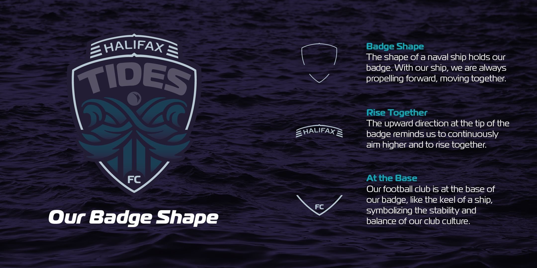
Halifax Tides: Rise Together
Last, but certainly not least, Halifax Tides FC introduced themselves to the wider Nova Scotia soccer community last night at the official brand launch event. The event was live-streamed on Instagram, so fans from across the country could take it all in. CEO, Dr. Courtney Sherlock and Diana Matheson were on deck for the big reveal.
It was always going to be nautical-themed given Halifax’s location on the Atlantic Ocean. The colours are ocean cyan, granite purple, and ship grey. The logo is bordered by the outline of a naval ship representing propelling forward. The crossing tide symbolizes the Nova Scotian flag, while the moon is meant to demonstrate the influence the club will have on the wider community.
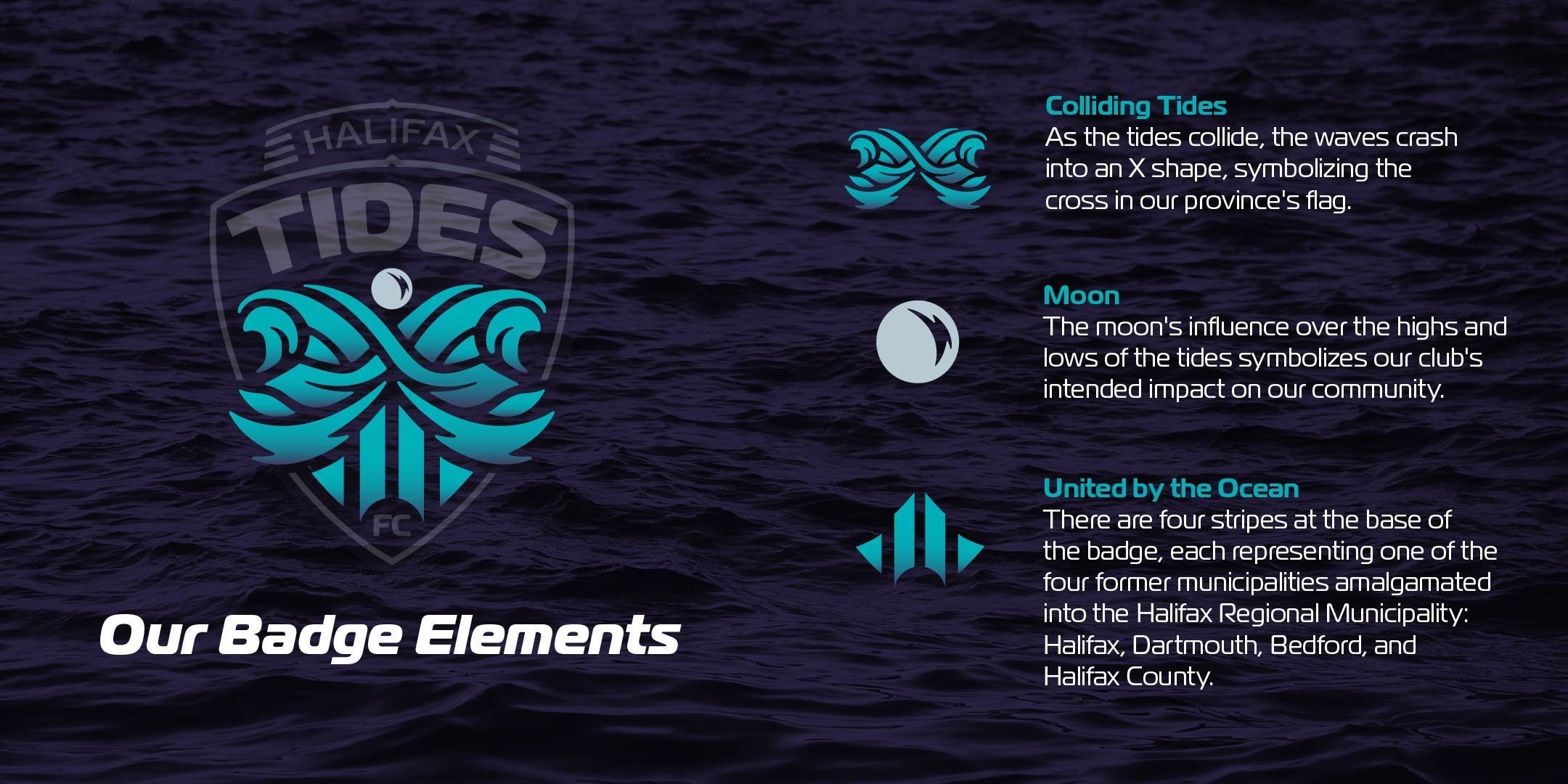
The logo and especially the colours were well received by fans from coast to coast. There were leaks prior to the launch thanks to some major sleuthing into business and trademark records, however, the colours were unknown. The combination of purple and teal will make great kits, and the merch they’ve released so far (the first team to have merch available to buy right away) looked sharp.
It’s all even more impressive when you consider the club leadership’s short timeline from securing the franchise to launching the brand. Sherlock stated:
"The fact that it's been just six months since I shared my intent to build a club with Project 8, which is now officially the Northern Super League, and that we could bring this project from an idea to a fully formed soccer club brand reveal is a testament to everyone in this room."
She also shouted out the five women who got the ball rolling on this project - Miriam Zitner (co-founder), Marie Bowie (former NT player), Amanda Sparkes, Tara Larsen, and Andrea Thompson back in 2022. If you haven’t read it yet, check out our blog post about the Halifax franchise detailing what we know about the ownership and stadium so far.
Mayor Mike Savage was also present, noting that Halifax is a “soccer city” and that it is the perfect time to welcome a women’s soccer team to the city. Other details surrounding the club are unknown, such as stadium and practice facilities, however they recently hired a Chief Business Officer, Harish Padke. Sherlock also stressed the economic impact a women’s sports team could have in the city and encouraged all Haligonians to get involved in any way they can.